Overview
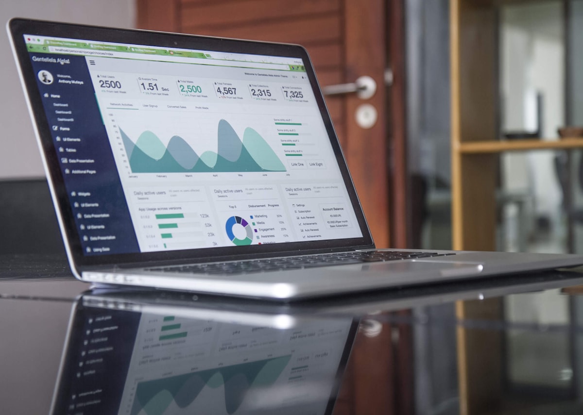
We built an analytics dashboard for a fintech client that needed to see how its investments were performing. It brings return-on-investment measures together in one place and presents them visually for the client's internal team. The client is confidential, so we describe the product rather than the organisation.
The Challenge
Investment figures tend to live in several places: spreadsheets, back-office systems and exports from platforms. Assembling them by hand into a report is slow and error-prone, and by the time it is finished the numbers have moved. A subtler problem is definition drift. Two analysts can compute return differently, for example by treating fees, timing of cash flows or unrealised gains in different ways, and then argue about which number is right. The team needed a single view that shows performance as it stands and calculates every measure the same way every time.
Who Uses It and How
The users are analysts, portfolio managers and senior staff inside the client. An analyst opens the dashboard at the start of the day, checks headline return, then filters by period or category to find which holdings drive it, and drops into the detail table to trace a figure. A manager wants the overview and a few comparisons across periods. An administrator controls who has access, because the data is commercially sensitive.
Our Approach
We began with the definitions. Before any chart was drawn we agreed exactly how each ROI metric is calculated, and we implemented those calculations once on the server instead of repeating them in the interface. Every chart and table therefore draws on the same numbers. We then designed the dashboard around the questions the team asks most often: how the portfolio is performing overall, which holdings contribute most, and how results compare across periods. Since the users are analysts, we favoured clarity and filtering over decoration.
What We Built
The dashboard offers summary panels for headline return figures and charts showing performance over time and breakdowns across the portfolio. Users filter by period and category to narrow the view, and tables provide the detail behind each chart. Data updates in real time as new information arrives, so the team is looking at current figures. Access is restricted to authorised staff.
Architecture and Data
Investment records, such as holdings, transactions and valuations, are stored relationally in MySQL. Laravel services compute the metrics from those records and expose them through API endpoints that take filters as parameters. The Vue.js front end never recalculates anything; it asks for results and draws them. Heavier aggregations can be prepared ahead of time or cached so the dashboard stays quick, and new data triggers a refresh of what is displayed.
Security, Privacy and Quality
Portfolio data is commercially sensitive, so every endpoint checks the caller's permissions server-side, sessions are protected and access is limited to named staff. Financial accuracy is the main quality risk, so calculation code is covered by automated tests with worked examples, including edge cases such as empty periods, zero balances, negative returns and rounding. We also reconcile dashboard totals against source figures during acceptance, so the team can trust the numbers before relying on them.
Technology
Laravel provides the back end that gathers and calculates data, exposes it as an API and controls access. MySQL stores the investment records in a relational structure that supports aggregation across many dimensions. Vue.js builds the interactive interface and Chart.js renders the charts, which is light and dependable and lets us tailor visuals to how the client reads its numbers.
Outcome
The client's team has a shared, consistent view of investment performance in place of manually assembled reports. Decisions can rest on the same definitions and the same current data, and new metrics or views can be added as the team's questions change.
Frequently asked questions
How much does it cost to build a custom financial analytics dashboard?
The main drivers are how many data sources must be connected, how complex the metric definitions are, how many chart and filter types you need, real-time requirements, and access control. Agreeing the metrics on paper first is the best way to keep the estimate honest.
Why calculate ROI on the server instead of in the browser?
Server-side calculation gives one authoritative definition, so every screen shows the same number. It is also easier to test and to protect. The browser then only displays results.
Should we build a custom dashboard or use an off-the-shelf BI tool?
Off-the-shelf tools are quick to start and good for standard reporting. A custom dashboard makes sense when you need specific calculations, fine-grained access control or a tailored interface embedded in your own systems.
Highlights
- Single view of ROI metrics across an investment portfolio
- Charts for performance over time and portfolio breakdowns
- Filtering by period and category with underlying detail tables
- Server-side metric calculation so every view uses the same figures
- Real-time updates as new data arrives
- Restricted access for authorised staff