Overview
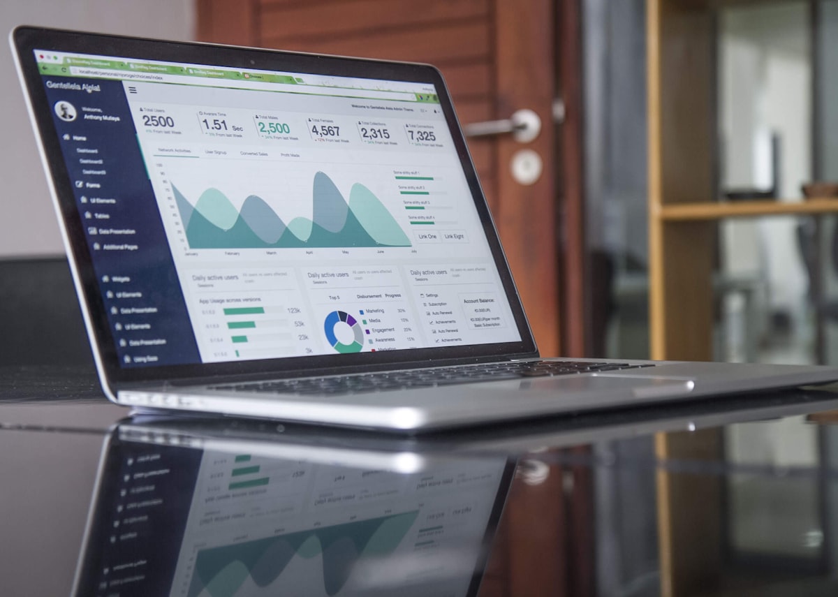
PulseBoard is a business analytics dashboard that we designed and built for operations teams who keep a live view of the business on a wall screen or a second monitor. It highlights revenue and transaction totals as they happen and shows how performance divides across categories, in a dark interface meant to stay on for long stretches.
The Challenge
A dashboard on permanent display has different needs from one people open now and then. It must be readable from across a room, must not glare in a dim operations area, and must show what is happening now instead of a morning snapshot. People watching it are usually doing something else and only look up when something changes, so it has to communicate quickly. Ordinary reporting tools seldom meet those requirements, and a display that freezes silently is worse than none.
Who Uses It and How
An operations lead puts PulseBoard on a wall-mounted screen in the team area. Colleagues glance at it while working; a jump in transactions or a category dropping away prompts a conversation. A duty manager uses it during a promotion or a busy weekend to see whether the plan is working. Nobody clicks much: the main interaction is looking.
An analyst or developer may tune which categories and figures appear, and someone from IT sets up the display device and keeps it running.
Our Approach
We designed for the glance. Revenue and transaction totals occupy the top of the screen in large type, legible at a distance. Under them, a category breakdown uses consistent colour coding so viewers can pick out strongest and weakest areas without reading labels. A dark theme gives comfort in low light and makes colour stand out. Data updates continuously, so movement on screen means something in the business.
What We Built
The screen opens with live totals for revenue and transactions, updating as new activity arrives. Below, the category performance section gives each category its own colour, in charts that make relative size and change easy to compare. Custom visual elements go beyond a standard chart set, so the display can match the way the business wants to see its data. The layout fills the screen sensibly, avoids small text and keeps interaction minimal.
Architecture and Data
A Node.js service receives or polls transaction events, aggregates them into running totals and category figures, and pushes updates to connected displays, typically over WebSockets or server-sent events. Sending aggregates rather than raw transactions keeps payloads small. A display that loses its connection reconnects automatically, shows a visible staleness indicator instead of quietly presenting old numbers, and fetches a fresh snapshot on return. Animated transitions are kept subtle so changes draw the eye without distracting it. Time zones and the boundary of a business day are configurable.
Security, Privacy and Quality
Wall displays are visible to anyone passing, so they should show aggregates, not customer names or order details. The feed itself needs authentication, and the display device should use a restricted account with view-only rights. Long-running screens bring their own quality risks: memory growth, sleeping devices and screen burn-in on some panels, so we test extended runs, reconnection after network drops, and readability at distance and in low light. Colour is never the only carrier of meaning, which helps colour-blind viewers.
Technology
React manages layout and live state, so individual panels refresh without redrawing the page. D3.js gives fine control over visual encoding, useful when standard charts do not fit and when smooth transitions help the eye follow changes. Node.js supplies the real-time data feed and aggregates transactions into the figures the interface shows.
Outcome
PulseBoard gives an operations team a continuous, easy-to-read picture of trading, suitable for a screen that stays on throughout the day. Changes in revenue, transactions and category mix are visible as they occur, so teams can notice and react sooner than with periodic reports. It is a practical example of tailoring a data visualisation to the room and routine in which it is used.
Frequently asked questions
How much does it cost to build a real-time dashboard?
Cost depends on the number of data sources, how live the updates must be, how custom the visualisations are, and reliability requirements for an always-on display. Bespoke D3 graphics cost more than standard charts.
Do real-time dashboards need WebSockets?
Not always. Polling every few seconds is simpler and often enough. WebSockets or server-sent events become worthwhile when updates are frequent and low latency matters.
What makes a good dashboard for a wall display?
Large type, few elements, high contrast, clear colour coding and a visible indicator when data is stale. Test it from the actual viewing distance.
Highlights
- Real-time revenue and transaction totals at the top
- Colour-coded category breakdown for fast scanning
- Dark interface for always-on operations displays
- Visible stale-data indicator and automatic reconnection
- Custom D3.js visualisations
- React, D3.js and Node.js